Highly condensed notes for the accessibility course on the w3schools website. In my humble opinion, the entire course is worth taking. However, if you have limited capacity, the following pages contain the most practical and/or important information:
- The website for Inclusive Design Principles
- W3Schools’ tutorial on semantic elements
- W3Schools’ tutorial on landmarks
- W3Schools’ tutorial on (not relying on) colours
- W3Schools’ tutorial on writing descriptive image text
- The Youtube video by Rob Dodson at Google, displaying the importance of headers
- W3Schools’ tutorial on visual focus
- W3Schools’ walkthrough of a screen reader UX
- W3Schools’ walkthrough on improving text zoom
- W3Schools’ walkthrough on improving page zoom
Testing accessibility
- Screen readers: NVDA
Elements
sectionis not related to content inmain- Aria-label & use case example: stay connected
- An
asideis still connected tomain‘s content- Aria-label & use case example: share this page
divandspanelements say nothing about the content. Only use these if no other option makes sensealinks should usually not open in a new tab or window. If it does, make the user aware of this behaviour and ensure you do it with a good reason (like highlighted on the link targets article on Adrian Roselli’s blog, which fully details why new tab/window behaviour is not advisable)- If you have multiple
navelements, usearia-labelto clearly communicate differences (e.g.aria-label="main") buttonelements that (for example) open a modal or a hamburger ùenu, should have anaria-label(e.g.aria-label="Enter zip code to find a dealer nearby"oraria-label="Open menu"respectively)- If two buttons are made for the same function (e.g. a text button and a icon button to open the same modal), they should be merged into one element
Skip link
Allows the user to quickly go to the most important part of the page. Test it out by pressing tab on WebAIM’s website
1 | <header> |
Custom controls
If you cannot use elements semantically (technical limitations, framework…):
roleattribute helps assistive technology users understand the purpose of the control. Possible values:"button"
"aria-label": accessible/clear name for the controlnameattribute is not enough: this is used for computer code, not human consumption- Aria-label should thus be written for people, without e.g. hyphens
- Slightly edited example from w3schools:
1
<select name="countryCode" aria-label="Country calling code">…</select>
value: the value or state of an element, that should be accessible- Edited example from w3schools of an accordion element informing whether it is open or closed:
1
<div role="button" aria-expanded="false">When do I get charged?</div>
- Edited example from w3schools of an accordion element informing whether it is open or closed:
Inclusive Design Principles
While the website for inclusive design principles expands all of these, here are the general principles supercondensed
Ensure comparable UX for every diversity, whether it be for user & device.
Ensure valuable UX for every situation, whether it be a screen inside or outside, for first time or long time visitors.
Be consistent in design choices.
Give full control to the user. Animations & parallax scrolling and infinite load can be obstructive. Users being able to change font size or zooming in can be essential.
Offer choices for actions. Gestures + menus, different views & layouts.
Alternative ways of presenting data, such as data tables for info graphics, should be available to all users as an option rather than a hidden link just for screen reader users. Accessible alternatives can benefit not just a specific target group but all users as long as we offer the choice.Prioritise content.
Progressively reveal features & content when needed, not all in one goAdd value through integration. Vibrations for notifications for deaf/hard of hearing folks. Voice interface for multimedia for those that struggle with other controls. Show password button on inputs.
Colour
- Colour contrast has to be good for all states: hover, focus, active, unvisited, visited, deactivated…
- Do not use colour as the only visual indicator of meaning
- An example from w3schools: links without an underline become unreadable on grayscale
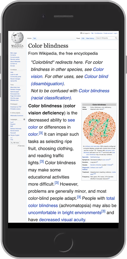
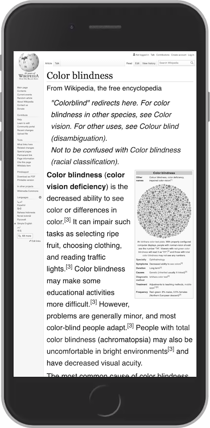
- Add text and/or icons alongside colour to communicate meaning
- An example from w3schools: links without an underline become unreadable on grayscale
Links
- Use
text-underline-offsetandtext-decoration-colorfor improved readability
Example from w3schools:
- If using (for example) a logo as a link, add an
aria-label, (e.g.aria-label="Toyota front page") - Stip down accessible names on links & buttons, remove
go to/page. For example,aria-label="Global distributors"is enough
Images: decorative vs meaningful
Can you remove it with no impact? Then it is a decorative image.
Decorative image
Either…
- Set
alt=""(note: NOT a lack of an alt attribute, specifically an empty one. Otherwise the filename may get read) - Set role & aria-label/aria-labelledby. Example from w3schools:
role="img" aria-label="Private house, modern architecture. Minimalistic with a big garage." - (Background image) Add the image using css background-image
- (Font icons) Set
role="img"&aria-hidden="true" - (Inline svg) set
aria-hidden="true"
Meaningful image
- Modified examples from w3schools, from worst to best:
<img src="output-460aebd-49.svg"><img src="redpencil-logo.svg"><img src="redpencil-logo.svg alt="Redpencil Logo>"<img src="redpencil-logo.svg" alt="Home of Redpencil">
Writing descriptive text
For some good examples, check out the w3schools tutorial on descriptive text. But remember some of the following things:
The value of the alt attribute should describe the image, or even better: the intention of the image
Imagine you were to explain a web page over a phone call with a friend, what would you say about an image?
- If zooming in on an image would reveal more info, consider adding it to the alt text
- If an icon has a meaning (e.g. “gold member”), write that meaning (e.g. “Gold member”)
Links
States
A visited state can help a person with short-term memory loss to understand which content has been read. A hover state can help a person with reduced muscle control to know when to click. A focused link helps keyboard users to know which link they are about to activate.
Three tips are described on w3schools:
- Removing the underline is almost always a bad idea (click here to scroll up to the section on colour)
- Contrast and focus
- The focussed state must sufficiently contrast the unfocussed state
- The outline (viewable when using tab navigation) must not obstruct the text. Use
outline-color&outline-offset
- Make hover very clear. Consider adding (for example) bold text on hover
(The following two gifs and theur alt text are also adapted from w3schools)
Accessible link text
- Makes sense without any context
- Explains clearly what the reader will get by clicking
Bad links –> good links examples adapted from w3schools
- Click here –> Find out more about the HTML language
- Read more –> Read more about how to get healthy
- Buy tickets to Fall Out Boy here –> Buy tickets to Fall Out Boy here
Tip: write your links under eachother and see if it make sense
- Donate
- Read more
- Visit the eshop
The read more can be replaced. On the Red Cross blog site example, it gets replaced with “Law & Policy”
Headings
- Don’t skip headings because of styling reasons: use them sequentially, and change the style with css
- If the design doesn’t call for a header, still make one and position it off-screen
Hidden headings and/or content
Common practice: sr-only class
1 | .sr-only { |
Example:
1 | <h2 class="sr-only">Headlines</h2> |
Note: a hidden heading could be redundant if a <title> element contains the same content/fulfills the same purpose
Focus
Do not remove or hide focus.
We have two options. Leave it or customize it. Removing it is not an option.
- Do not use
outline: 0; - Be careful with parent divs with
overflow: hidden;
Two options
- Default focus: familiar for the user, no coding needed for you
- Customise visual focus: may be needed if default focus has low contrast with your website, or can be used to align better with the site’s colour palette
Forms
<label>
- Read out loud by screen-reader on input focus
- Allows easier clicking on checkbox/radio button
- Ensure that
for="input-id"
Required fields
- Form labels often contain
*orrequired - But make sure to also set
requiredandaria-required="true"
aria-label
Fields without visual labels still need a label
- Do not rely on placeholder, as these are not valid accessible names
- Use
aria-label, e.g.aria-label="Enter search term"
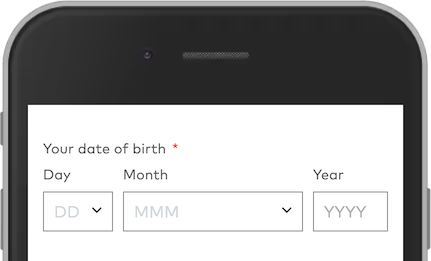
<legend>
- Sometimes a “higher” level label is needed (e.g. date of birth)
- Visually
Day,MonthandYearlabels make sense, but this may not be the case for a screenreader - Use
<fieldset>and<legend>
Example from w3schools:
1 |
|
Autocomplete
This is convenient for everybody. This is very helpful for user with motor impairments or cognitive disabilities.
Example autocomplete attributes:
1 | <input |
Errors
Errors have to be perceivable & understandable to people who are colour blind, blind or low visioned, or who have limied cognitive abilities.
Accessible error messages:
- Written in text. Color & icons can be used, but not alone. Ideally:
- Written in text
- Warning icon
- Red border
- Close to the element that has failed
Design elements near each other are perceived as related, while elements spaced apart are perceived as belonging to separate groups.
- Nielsen Norman Group, Proximity Principe in Visual Design
- Errors close to failing fields
- Big margin between fields
- Informative, helping the user
- The more informative and precise, the better
- Ask the users if they udnerstand what is wrong. If not, write the error more precise
- Associated to the failed element in the code Aside note: when the user submits a form, the focus moves to the first invalid field
1
2
3
4
<!-- Add aria-invalid="true" once the the form control fails -->
<input name="firstName" id="firstNameInput" type="text" pattern="[^.]*?" aria-describedby="firstName-length-error" aria-invalid="true">
<p id="firstName-length-error" role="alert">Your first name must have at least two letters and no unusual characters</p>
<!-- role="alert" makes the screen reader read the content, even if it's not in focus -->
Zoom - Text Size
Some people need larger text to perceive letters
font-size: Userem; you can convertpxto itline-height: avoid using absolute units. For example, use1.2;instead of22px;height: avoid using absolute heights (e.g.66px;), and instead letting line-height & font-size run
Original
Original, zoomed in
With rem font-size
With rem font-size, line-height, and with height and -webkit-line-clamp: 3 removed
Zoom - Page
Ensure that…
- Horizontal scrolling is avoided
- All content is available (not clipped, truncated or obscured)
- All functionality is available
- Avoid text in images
- Provide space for key content
Page zoom often triggers mobile view on responsive sites, which is good.
Note: the examples provided on the W3Schools Page Zoom Accessibility page are great illustrations as to the importance of supporting page zoom, but there is barely any way to condense them. Below will be a general list of tips for reference, but I highly advice checking out the page.
- Set viewport (
<meta name="viewport" content="width=device-width, initial-scale=1">) - Make the site responsive
- Minimize buttons for other features (e.g. chat, cookie consent). Use minimized as default where possible
- Vector graphics/SVG > raster graphics/PNG
- Avoid text in images. When zoomed, it gets pixelated, clips out of the browser window/view (requiring (horizontal) scrolling to read it all) and is not translatable nor searchable
- Ensure mobile ads only appear on mobile devices
- When using position fixed/sticky, ensure it doesn’t cover content when zoomed
(Appendix) Assistive technologies and those that use them
- People with hand tremors/not able to grip a mouse –> Keyboard navigation
- People with mobility disabilities –> Voice control, eye tracking, switch devices
- People who are blind –> Screen readers, braille displays, speech recognition
- People with low vision –> Screen magnification
Thanks to standard methods we don’t need to code for specific technologies, and it’ll be accessible for all
Important things to additionally note:
- Keyboards are also used on mobile devices (thus stuff like keyboard focus remains important)